The Washington Post
Video Site Redesign
Redesigning The Washington Post's news video product for increased user engagement.

In 2013, before I joined, The Washington Post launched PostTV—a video product that featured news shows hosted by reporters. The news shows weren’t popular and were never able to find an engaged audience. After eight months of experimentation, The Post cancelled the news shows and needed to redesign their video site.
In 2014, I was hired to lead the responsive site redesign. The team developed a strategy to improve content discoverability and deepen engagement.
Role
Lead and sole designer. Research summaries, idea generation, wireframes, UI design, developer handoff
The Team
Phoebe Connelly—Product Owner, Deputy Director of Video
Vidya Viswanathan—Director of Engineering for Video
Gregory Auld—Frontend Developer
Joey Marburger—Design Director

The Problem
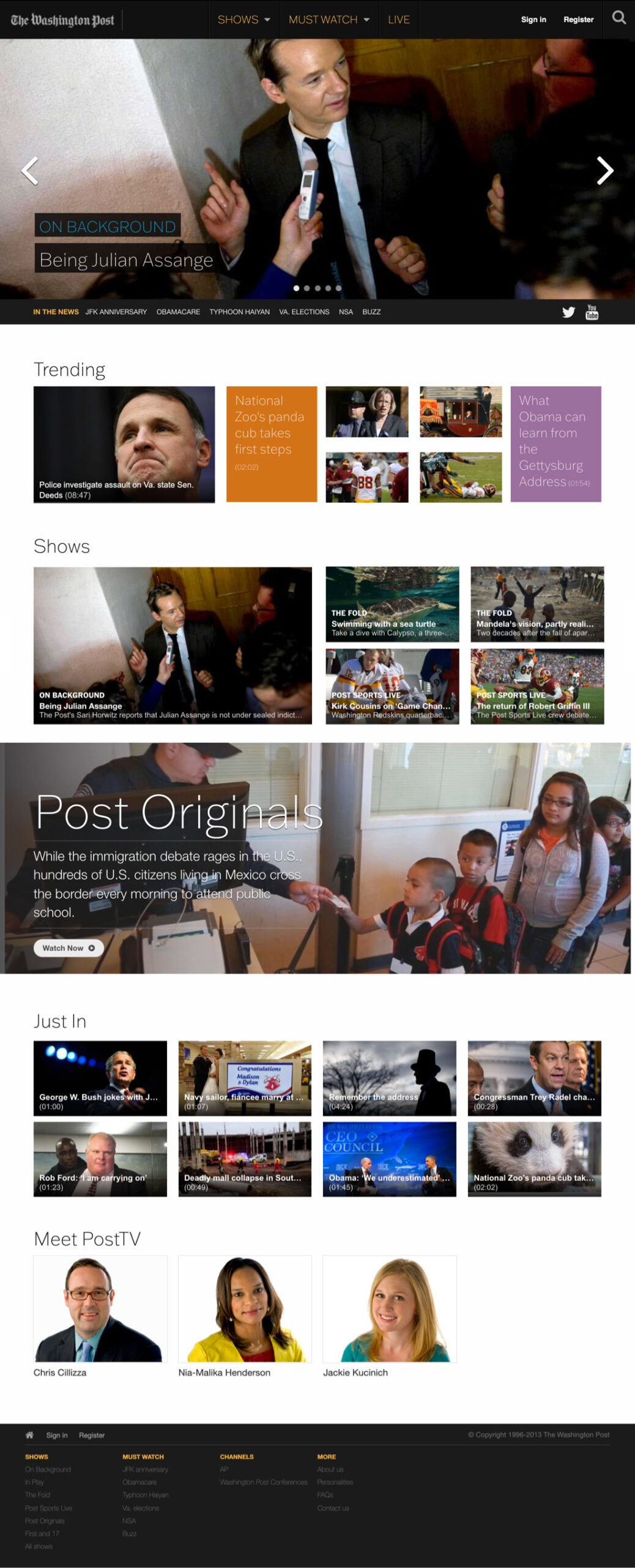
Washington Post customers weren’t engaging with PostTV content in a way that was sustainable to the business. The old site was centered around news show programming which required visitors to watch at a scheduled time each day. In addition, the site had a long page layout which made content discovery difficult.
Most news consumers don't like watching videos online. They find watching videos time-consuming compared to reading an article, the ads annoy them, and they have low tolerance for the time it can take for videos to load. Those common barriers make it particularly challenging for news organizations to engage news consumers with video content.
Objective
Design a responsive video site that engages users with content that is relevant and interesting to them.
Goals
- Increase engagement as measured through return visitors, videos per visit, and video completion rate
- Remove the PostTV branding and news show-centric architecture
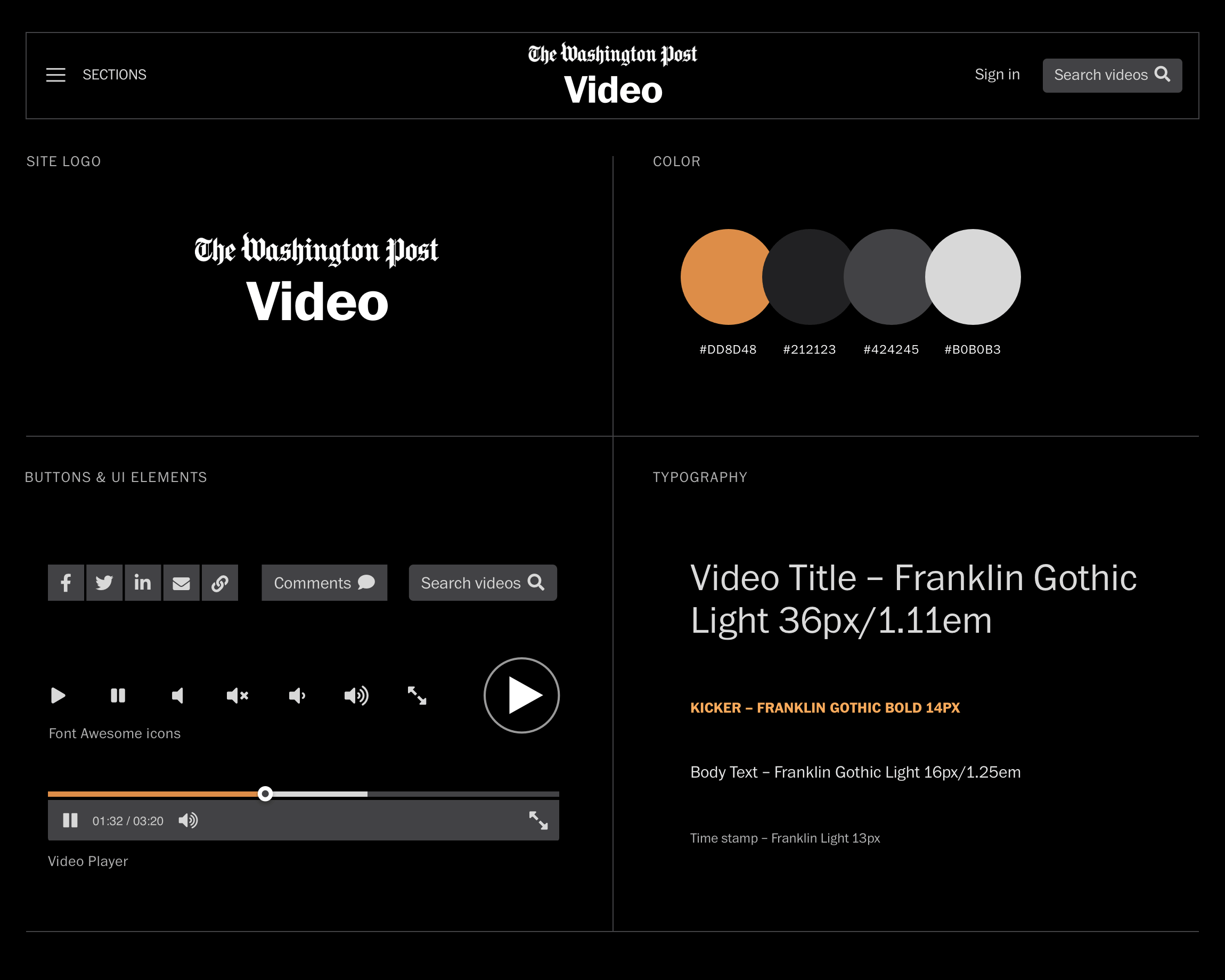
- Increase the visibility of video titles, video playlists, and social share icons
- Improve use of space across viewport sizes
Increase the size of the video player
The site before the redesign:
Discovery
Understanding the problem
I began the project by interviewing stakeholders in order to understand the business goals of the redesign and to uncover any existing knowledge about the customers. Those discussions revealed one key business goal:
Increase engagement as measured through return visitors, videos per visit, and video completion rate.
Exploring concepts through sketching and workshops
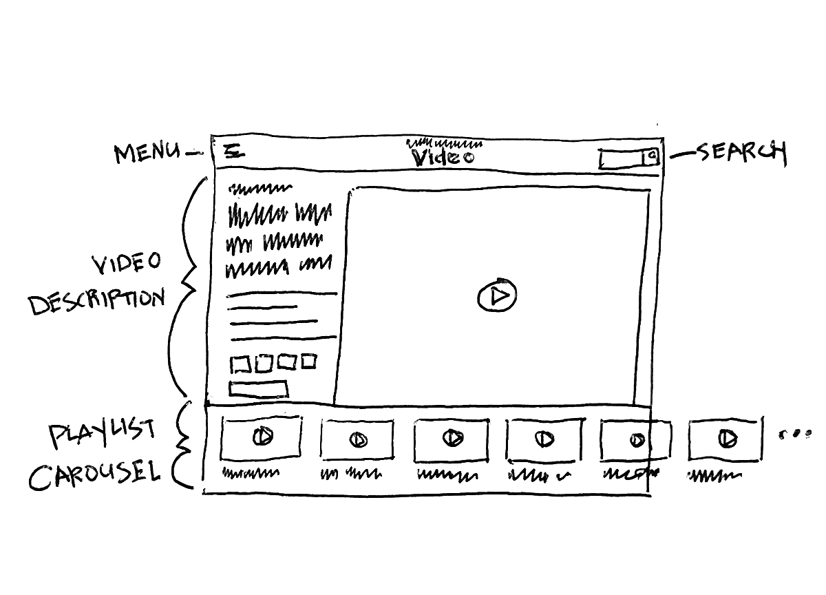
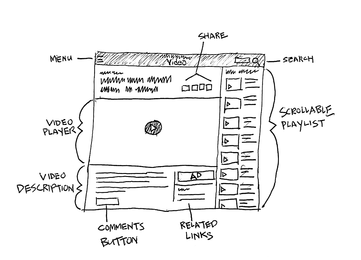
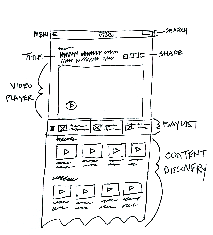
A key insight from the analytics team was that the average scroll depth was extremely shallow. The previous layout was long and full of video collections, but most people were not scrolling to discover the content. With that in mind, I sketched shallow pages with layouts that positioned video collections higher on the page.
Style Tile
